Hi everyone. I just wanted to thank all of you so much for your kind notes and well wishes in the past few days since I tested positive for Covid-19.
After being virtually asymptomatic at the time of my first positive test late Saturday evening, I have definitely been through the wringer. I’m going to be fine and by every technical definition I have “mild illness,” but dang that term could use a tweak. “Absolutely miserable, but without true medical distress” would more accurately summarize things the last three days. In fact, this is the first time in days I’ve felt up to writing. I’ve missed you all! (I’ll say more about my overall Covid experience later, but for now, I am finally feeling well enough to share something kind of interesting and nerdy, so I thought I’d do so.)
As many of you know, one of the drums I have been beating for years now is that rapid antigen tests are not only very valuable diagnostic tools (when used correctly), but that they carry much more meaning than we give them credit for. Specifically, the darker the test line is in comparison to the control line, the more virus the source patient is shedding at that time.
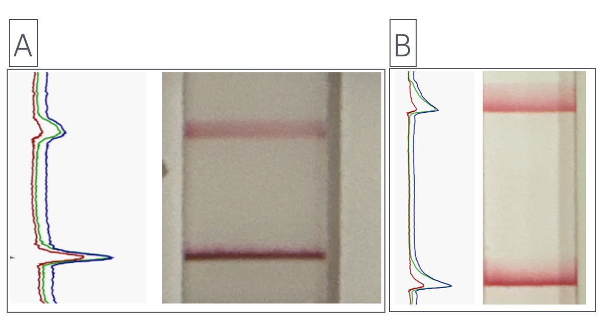
I decided to play around with that concept using some iPhone software. I’ll try to make something more sophisticated out of all of this once I’m feeling better, but for now I wanted to show you the results of two rapid antigen tests I took this evening:
In “Test A” (the test on the left), I did everything “as instructed.” That meant 15 seconds of nasal swabbing. In “Test B” (the test on the right, I intentionally barely tickled each nostril. Maybe just a couple of seconds each.
In each test, the “test” line is the lower line and the “control” line is the upper one. In Test A, the test line is visibly much stronger than the control line. In Test B, the test line is stronger than the control line, but it’s a lot closer. Again, this reflects the fact that I intentionally got a ho-hum sample on Test B—to make this exact point.
Wondering what the colored squiggly lines are? These are optical readouts from a free iPhone program (spectraView). In each instance, the further to the right the spike goes, the stronger the signal. So in Test A, the intensity ratios are far greater than in Test B. Technically, these ratios can quantify the difference between the test and control lines.
What I’m hoping to do is get a little more sophisticated with my testing in the coming days. (I still haven’t figured out how to get the app to quantify the difference using this particular app; there are computer-based programs that do this, but I haven’t used them since I was in a lab studying HIV, and that was 13 years ago. I need to figure that out again.)
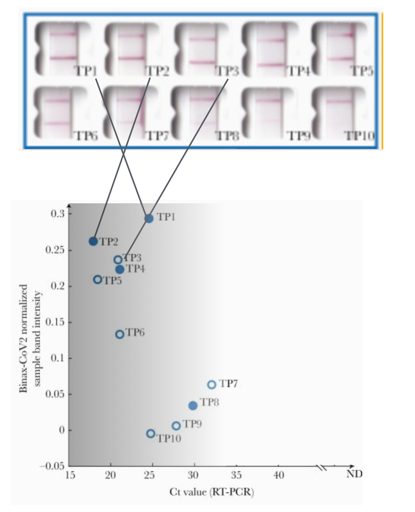
Meanwhile, below is a figure from an important scientific paper that I never get tired of reading. It’s from UC San Francisco and the laboratory of Dr. Joseph DeRisi. The DeRisi lab correlated the strength of rapid antigen tests to the viral loads of Covid-19 patients. There are ten rapid antigen samples of various strengths (5 per line). Below that is a graph that goes with it. The Y (vertical) axis indicates the strength of the test line (or “band intensity”); the higher the number, the brighter the test line. The X (horizontal) axis is the cycle threshold (“Ct value”); the smaller the number (i.e., the further to the left you go), the more virus there is (that’s because it took the test fewer cycles to detect a positive test). Any Ct value smaller than 25 or so is a lot of virus (i.e., very contagious). To make this more clear, I added the grayscale background. At the far left, the background is darkest. This is the area of most contagiousness. As we move to the right, the patients become less and less contagious. By the time we get to a Ct in the low 30s, transmission of Covid-19 is pretty unlikely.

I’ve also added three lines to the figure. They connect the picture of three individual rapid tests to each of their corresponding dots on the graph. (“TP” means “true positive.") As always, the control line is the top line, and the test line is the lower one. In the case of TP1, the lower test line is far more intense than the control line. Notice that the three tests I’ve highlighted are the ones with the highest band intensity (i.e., highest Y axis values). Their Ct values are all under 25, so they are likely to have been quite contagious when these tests were taken.
And if you’re wondering why the dot for TP3 is not filled in, the answer is that open dots were asymptomatic patients. This underscores another point I always want you to understand. Symptoms and contagiousness don’t necessarily go together. Patient 3 (“TP3”) had no symptoms but a lot of virus; that person’s lack of symptoms does nothing to increase my interest in being anywhere near them at that moment.
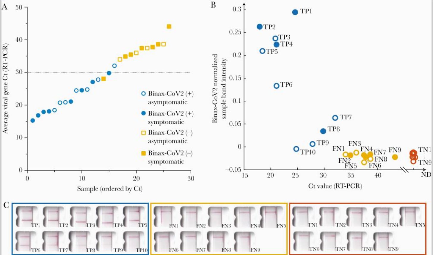
Lastly, I used image editing software to omit a bunch of other datapoints to minimize confusion. Below is the original figure:
As you can see, there’s a lot more in the complete figure than I’ve explained. And this is such an amazing figure that I’d be glad to explain it to you all in a Zoom webinar once I’m feeling up to it. It would probably take just 10-15 minutes to go through what everything means, if you’re interested in learning more about this.
Okay, my burst of energy has ended. Time to go back to sleep.
More soon, hopefully!
—Jeremy


Hope you’ve turned a corner and feeling better! “Absolutely miserable, but without true medical distress” is much more apt than “mild”! ❤️🩹
Your contrasting the technical definition of illness versus your experience of "going through the wringer" clearly signaled the reality of this virus. Ugh! I' not going to "test" the strength of my immune system by stopping my protocol of avoiding small indoor venues, crowded large venues, and masking in large stores...which I only enter when they are not crowded.
I am really glad that you have recovered! (and thanks for mentioning the spectraView app. which looks like fun.)