


Disparities during the Covid-19 pandemic: a final account.

A few moments ago, JAMA Network Open published a study that I am incredibly proud to have written. The work is entitled “Racial and Ethnic Disparities in Age-Specific All-Cause Mortality During the Covid-19 Pandemic.” The manuscript is the culmination of years of work, and was made possible by an absolutely incredible team of experts who came together to create what we believe is an important contribution to our overall understanding of the pandemic. For any public health researchers in the audience, you’ll recognize many names of some incredibly influential and insightful scholars on the list of co-authors:

As many of you know, during the emergency phase of the Covid-19 pandemic, I somewhat unexpectedly assembled an impromptu research collaborative—made possible by Dr. Harlan Krumholz and his superb colleagues at the Yale School of Medicine’s Center for Outcomes Research and Evaluation—dedicated to studying all-cause excess mortality. I’m especially grateful to Harlan for bringing together so many incredible experts from around the United States to work on this project, many of whom I had not had the chance to work with before. Without a group of this caliber, this work would not have been possible.
What we did is a simple concept, really. We measured all-cause excess mortality during the pandemic, by race and ethnicity and (crucially) by age group. From there, we could measure the disparities in mortality. This is possible because, generally, the number of deaths that occur in a given period is quite predictable. It takes an extraordinary event like the Covid-19 pandemic to perturb the norms.
Indeed, that’s what happened, and we knew that was happening even early in 2020.
What we found…
Disparities by race and ethnicity during the pandemic are of course known. We wanted to answer three questions:
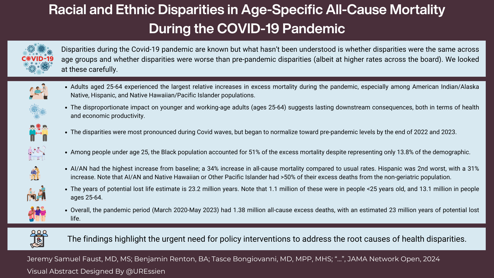
What were the final figures on all-cause mortality for the US overall? We found that there were 1.38 million excess deaths during the public health emergency, which spanned from March 2020 to May 2023.
Did disparities that existed before the pandemic just get replicated at higher rates? Or did disparities between certain race and ethnic groups widen? We found that disparities widened, particularly during Covid-19 waves.
In which age group were the disparities the greatest? Surprisingly, we found that disparities were greater in the “core” working age adult population (ages 25-64). In fact, compared to normal mortality, this population—and not the geriatric population—had the largest relative increase over baseline figures. During the pandemic, overall mortality from all causes was up 15% in the total population. But it was up 20% in the population ages 25-64 compared to just 13% in the population ages 65 and up. So while a numeric majority of excess deaths occurred in the geriatric population (because that group has the highest mortality at baseline anyway), the largest percent increase (ratio) was in the working-age population. This has staggering implications in the long run, in terms of economic wealth, among other things. Of the 1.38 million excess deaths during the pandemic, 454,000 were in people under age 65. That’s a lot more than most people realize, I think.
I hope you’ll notice some of the tragic and harrowing statistics summarized in this infographic, created by Dr. Utibe Essien, one of my colleagues who co-authored the paper:
Behind the scenes.
I also want to share with you a bit about the process that we undertook in writing this paper—after all this is Inside Medicine. First, the list of co-authors—my colleagues in this work—is simply unmatched in terms of expertise on these issues, ranging from the statistical analysis to the fundamental meaning of our findings. I learned so much doing this work, not just about the pandemic, but about the inequities in our society.
A few words about the math under the hood. A few of us (including Inside Medicine data guru Benjy Renton) worked rather intensely on this. We had a ton of help from the brilliant data scientists from Yale. Together, we worked on and refined the models that power the paper. The main thing is knowing how many deaths are “expected” in a given time. Without that, we can’t know how many excess deaths there were.
But early on, we confronted an unusual problem. There were so many harrowing and important findings, that we didn’t know which to accentuate. This was basically the opposite of “p-hacking.” (“P-hacking” is when researchers study so many things all at once that something statistically significant pops up by chance.) We had so many slam dunk and massively important findings that we couldn’t decide how to present it all, and what to highlight. The “braintrust” of researchers with vast experience in big data outcome statistics and disparities research guided that process. I just have to tell you how lucky I was to work with these colleagues, who represent diverse backgrounds, various areas of expertise and viewpoints, and several prestigious academic institutions.
Another small but important thing I’m proud of is that we tested our models rigorously, so that we knew how confident we could be in our quantitative findings. Our excess mortality findings were generated by taking five years of monthly pre-pandemic data (March 2015-February 2020) from CDC data tranches and asking our computers to project what mortality should have been from March 2020-May 2023 were it not for a pandemic. The models took both pre-pandemic mortality trends and population changes into account. (We also adjusted the population in “real-time" during the pandemic because, tragically, the US population was smaller than it was expected to be due to all these excess deaths.)
To make sure that this was sound, we actually “played this game” with old data. We fed the model mortality and population data from March 2012 to February 2016, and asked it to predict mortality for the three years from March 2016-February 2020. (The model was blinded to data from March 2015 onward.) We then looked at how well the model had predicted what really happened. During that period, the model predicted 8.58 million deaths; in reality, 8.52 million deaths occurred. In other words, the model was off by less than 1% over a three year period. So when we report that mortality was up 15% during the pandemic, we know that this can’t have been statistical noise. This is called “model validation.”
Interestingly, at one point we were trying to validate our model on a particular age group—young people. We looked at a number of 5-year “before” periods. For example, we’d use data from 2009-2014 to predict the next three years. When we did this for young people, we kept finding that our models pumped out lower mortality estimates than really occurred in 2014-2017. Then it occurred to me: the reason our model predicted lower mortality in young people in that time period was not a problem with the model, but with the world. The opioid epidemic had erupted. So, excess deaths had occurred. It was a startling realization—both that our models were that good and how tragic the human toll of that crisis has been.
Lastly, the peer review process was, in this case, extremely useful. The paper was reviewed by experts who clearly wanted to help us improve our work. I’m grateful to them.
Admittedly, the paper itself is a little dense and, frankly, rather depressing at times. It’s hard to fathom the meaning of these disparities, but it is my hope that this work forces us to think about them.
Also, I will say that the study was definitely written for an expert audience. But if there’s interest among this readership, I would be glad to do a video Q&A with you all and walk you through the paper and some of the other findings that are important to understand. In the meantime, if you have questions or comments for me or any of my co-authors, please ask them in the Comments section (which I am making open to all readers today). Thanks for reading…
I am sad but not surprised by these findings.
A friend whose specialty is Housing Policy showed me two side by side maps at some point during this pandemic. One side was a 1930s redline map of a US City (I forget which city), basically where you couldn't get a mortgage because it was a Black neighborhood. The other side was a map of COVID death rates. The two maps were shockingly similar.
I would be interested in a Q and A video walking us through these important findings.