We are back with another Data Snapshot! Before that, just a quick reminder of how much work goes into each installment of Inside Medicine—which makes it expensive to keep up. The more readers upgrade to a paid membership, the longer I’ll be able to keep doing this and keep most of the content free so that we can continue to spread reliable, data-driven information. Thank you to those who have already upgraded. I truly appreciate your support and your partnership! -Dr. J
Now, on to the freshest data out there…
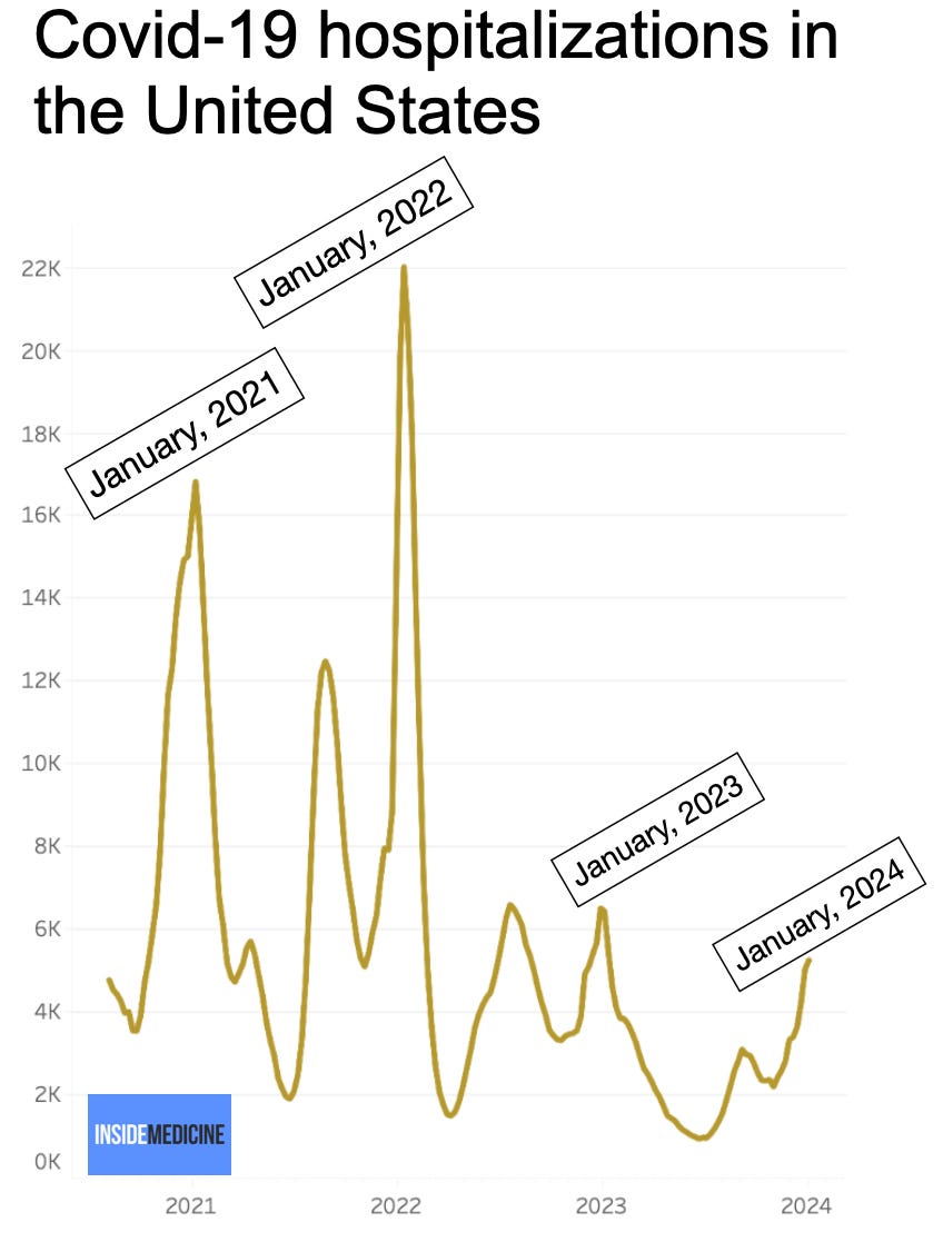
Has respiratory virus season peaked? We’ll know soon. By this time in 2021, 2022, and 2023, Covid hospitalizations had already topped out. The latest update to the Inside Medicine Covid-19 Metrics Dashboard shows a possible decline on some key metrics, but anything can happen.
Covid hospitalizations are lower than prior peaks.
National Covid hospitalization rates are lower than during previous peaks. But what this means is a little less clear. Wastewater levels—the best surrogate for infections—are high.
These lower hospitalization numbers reflect either something good or something misleading. Here are some possibilities:
Greater immunity (good news).
Less testing, leading to missed cases (bad news).
A combination of these.
Indeed, to some extent, we can’t compare current hospitalization rates to past seasons because hospitals are no longer doing universal Covid testing for all admitted patients. Some argue this means we are no longer overdiagnosing Covid, by reporting patients who were hospitalized for other reasons, but who happened to be simultaneously infected. While that happened some, universal testing actually did more of the opposite; it unveiled how many medical hospitalizations were due in some (or large degree) to Covid (and viruses in general). One recent study mirrored some internal work that Benjy Renton and I did last year but didn’t publish, showing that cancer mortality rose and fell in lockstep with Covid rates.
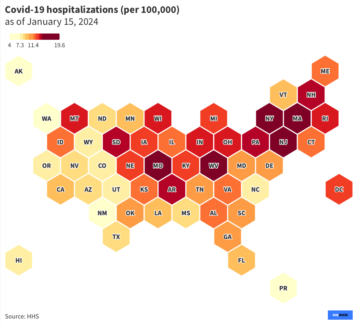
Here’s a heat map of Covid-19-related hospitalizations by state for the most recent week of data. For an interactive version of this map, click here.
Hospitals are quite full.
Since we are less certain how much Covid is in our hospitals than before, one way to assess things is to look at hospital and intensive care unit (ICU) occupancy. At the moment, hospitals are pretty full. Overall, inpatient bed occupancy is similar to prior Covid peaks. That tells us that Covid, flu, and RSV (and other viruses) are stretching our resources yet again. Here’s a map showing which states are feeling it the most. For an interactive version of this map, click here.
ICUs are also pretty full.
Severe illnesses typically go to the ICU. Currently, ICU occupancy is similar to the worst of 2023, but not as bad as the winter of 2022 (early Omicron, when hospitals were bursting at the seams and which corresponded to the last massive peak in all-cause mortality we had during the pandemic). For an interactive version of this map, click here.
Conclusions.
Influenza and RSV seasons are generally predictable. Covid-19 seems to have joined their ranks in seasonality. While the virus is still too new (and too contagious) to largely disappear in the Spring and Summer (as flu and RSV do), we keep seeing winter peaks, just as we’d expect from any other seasonal coronavirus. As a result, our hospitals and ICU capacities have been getting stretched even worse than usual every January since this virus came onto the scene. While Covid-19 may not be the only game, it’s not a good addition to what is already a rough patch in our national well-being every winter.
For a deeper look at the metrics we’re tracking, including state, county, and national trends for Covid-19, influenza, and RSV, here are those links again:
Inside Medicine Covid-19 Metrics Dashboard
Weekly Covid-19 hospitalizations by state (updated January 15, 2024).
Inpatient hospital occupancy by state (updated January 15, 2024).
ICU occupancy by state (updated January 15, 2024).
Questions? Comments? Requests? Leave them below and let’s talk!
Thanks to Benjy Renton for maintaining the Inside Medicine Covid-19 Metrics Dashboard.


I see the value in addressing the burden that ILI brings seasonally, with C19 playing a large role in that while *also* being a year round factor. It's astonishing that healthcare settings aren't more proactive with airborne infection control (mitigation efforts, testing), seasonally or otherwise. Is there any way we can help to address that?
I'm thankful for your data updates. When I consider the area under the curve, it certainly doesn't look like Covid is seasonal. It's transmissibility and the fact that high tides occur across climate conditions while never retreating below a high threshold, it looks nothing like other viruses. Flu data across the year resolves to a tiny blip for all but a few months, while C19 is ever-present at orders of magnitude above anything else. (3rd chart in the link below) The main reason I'm concerned about talking in seasonal terms is that the public has been trained to ignore the presence of Covid. High population immunity doesn't seem to be getting us any closer to shifting that high baseline of Covid. What do you think can help us to effect change?
Thank you and Benjy for good work.
https://thosenerdygirls.substack.com/p/a-lot-more-americans-are-dying-of
Thanks for the data: while Covid is not seasonal--peaks occur in several seasons--it definitely adds to the burden of respiratory diseases that are seasonal. This year's surge also seems to be driven by the JN.1 variant, low vaccination rates, and lack of behavioral mitigation. As there is no PHE and dismantling of the public health support to track and treat Covid, it makes this data so helpful, as I'd written before, we're in an information vacuum. I hate going on Twitter to follow BNO news and try to avoid the crazy of the platform. Lots of viral activity and strained health care systems--especially in the northeast where I live.