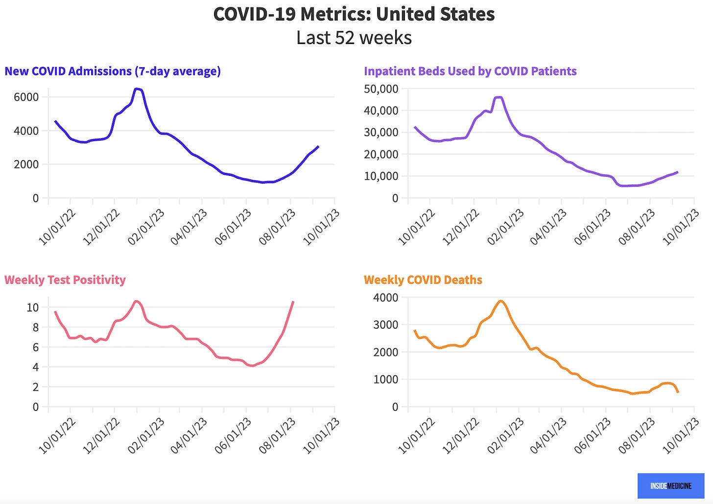
Fall officially starts this Saturday, September 23rd. So, it’s time to check in with our Inside Medicine Covid-19, flu, and RSV dashboard. If we arm ourselves with data, we can make the best choices. I know that’s why you’re here, so let’s get into it!
As you can see (upper left panel), new Covid hospital admissions have increased since summer lows.
Glass half-empty: On one hand, the 7-day national average for new Covid hospitalizations has doubled since a month ago.
Glass half-full: On the other, these hospitalizations represent just a small fraction of all-time highs, and are lower than a year ago at this time. If we zoom in on just the last 52 weeks (see below), we can see that more clearly….
Nuance: Now, it’s possible that hospitalizations are being under-reported. A year ago, virtually all hospitals were testing most (or all) patients getting admitted for any reason. Now, only some patients get tested.
One viewpoint on this would say that this means fewer “not-really-Covid” admissions are getting tallied now (think: car accident victim who happens to have Covid. This is actually fairly uncommon). Another viewpoint (which I tend to subscribe to) would say that less testing in hospitals means hospitals are likely missing “Covid tip-over” cases that don’t look conspicuously like Covid, but actually were driven in large part by Covid (Example: famous doctor gets Covid, falls in the shower due to weakness, experiences internal bleeding adjacent to the brain).
Test positivity is up. One bellwether to watch is weekly test positivity. Positivity is the number of positive tests divided by the number of total tests reported. Testing is pretty low these days, but increases in positivity over the last month indicate more testing among patients with symptoms who are interacting with the healthcare system. So that’s a trend to watch.
Which states are winners and losers this week? Hospitalizations per capita are probably the best metric to follow right now. Florida is literally the worst in the nation currently and that’s before the new booster rollout, where Florida is expected to fare poorly, in part due its Surgeon General’s messaging and recommendations on fall Covid vaccines (particularly for the high-risk population, where his aversion is simply baffling).
What happened to wastewater levels? We’ve been reporting the CDC’s method of reporting on wastewater (coronavirus levels measured in local sewage). The problem is that the CDC has been reporting percentiles for each jurisdiction, which is confusing people—even us! We’re going to keep doing that, but we’ve updated the dashboard to make it clearer what is being shown.
Let’s use Massachusetts as an example for why using percentiles might be confusing. The CDC reports that for the most recent week, Massachusetts wastewater is in the 47th percentile. That does not mean the state is at 47% of its own maximum. It means that since the CDC started measuring, 46% of all weeks in Massachusetts had lower wastewater levels than current levels, while 53% of all weeks had higher wastewater levels. But because the top 5% of all weeks were much higher (think: early Omicron) than the bottom 95% of all weeks, Massachusetts is nowhere near its maximum viral levels. It’s probably well under 10% of its maximum viral levels.
There are problems in the CDC data that make it very hard to get a sense of where a state or county is with respect to its own, regional, or national wastewater level maximums. We’ve come up with a really nifty potential way to solve that problem, but it’ll require some digging. We’ll get back to you on that. (Did we mention we love being data geeks?)
In the meantime, I’m using local wastewater percentile in conjunction with hospitalizations (and to some degree the other metrics we show) to get an overall sense of how particular jurisdictions are doing.
How’s flu and RSV? So far, influenza and RSV activity remain low. That’s to be expected in September. That said, we’ll celebrate wins whenever we can.
To see how your area is doing on all of these metrics and more, check out the Inside Medicine Covid-19 metrics dashboard.
Questions? Comments? Share below!
Thanks to Benjy Renton for curating the data for our snapshot and keeping the dashboard up and running.


On the first set of charts, Tableau has replaced the last digit(s) of the year with ellipses, which is unfortunate.
It might also be helpful to force the major marks on the time axis be every 3 months.
These are minor issues compared to the great value these dashboards provide!
The Weekly Chart of Positive Tests is back up to 2022 Holidays & post 2023 New Year. The newly authorized Booster cover three of the most transmissible Sub-variants.